For safety experts, data visualization is a critical tool in identifying potential risks and biases in AI systems. Effective visualization can reveal hidden patterns, outliers, and relationships in data that may lead to unfair or unsafe outcomes.
By mastering these techniques, you can better detect and mitigate safety issues early in the AI development process, ensuring more robust and equitable systems.
Introduction
Data visualization is a critical step in the data analysis process. It helps us understand the distribution, trends, and relationships within the data.
Using libraries like Matplotlib, Seaborn, and Plotly, we’ll explore the “House Prices – Advanced Regression Techniques” dataset from Kaggle to uncover hidden patterns and gain insights that can inform our predictive models.
Dataset Overview
The “House Prices – Advanced Regression Techniques” dataset provides a comprehensive set of features describing the properties of houses in Ames, Iowa. The target variable is the sale price of the houses. The dataset includes features such as:
- MSSubClass: The building class
- MSZoning: The general zoning classification
- LotArea: Lot size in square feet
- Street: Type of road access
- YearBuilt: Original construction date
- GrLivArea: Above grade (ground) living area in square feet
- OverallQual: Rates the overall material and finish of the house
- SalePrice: The property’s sale price
Getting Started with Data Visualization
1. Matplotlib: Basic Plotting
Matplotlib is a versatile plotting library for creating static, interactive, and animated visualizations in Python. It provides control over every aspect of a figure.
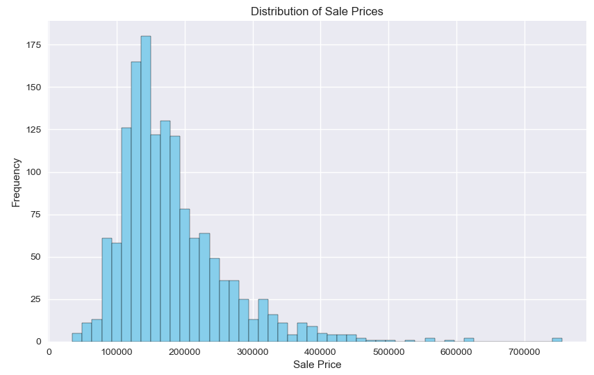
Example: Sale Price Distribution
# Sale Price Distribution
plt.figure(figsize=(10, 6))
plt.hist(df['SalePrice'], bins=50, color='skyblue', edgecolor='black')
plt.title('Distribution of Sale Prices')
plt.xlabel('Sale Price')
plt.ylabel('Frequency')
The histogram created using Matplotlib reveals that the distribution of sale prices is right-skewed, indicating that most houses are sold at a lower price range, with fewer houses sold at higher prices.
2. Seaborn: Statistical Data Visualization
Seaborn is built on top of Matplotlib and provides a high-level interface for drawing attractive statistical graphics. It is particularly useful for visualizing complex relationships between variables.
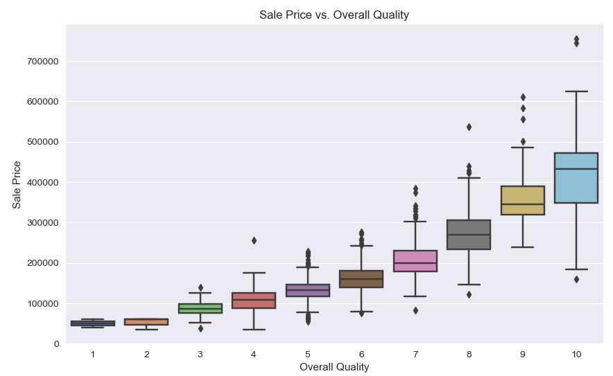
Example: Sale Price vs. Overall Quality
# Sale Price vs. Overall Quality
plt.figure(figsize=(10, 6))
sns.boxplot(x='OverallQual', y='SalePrice', data=df, palette='muted')
plt.title('Sale Price vs. Overall Quality')
plt.xlabel('Overall Quality')
plt.ylabel('Sale Price')
The boxplot generated with Seaborn shows a clear trend: houses with higher overall quality tend to have higher sale prices. This suggests that the quality of construction and materials significantly impacts the house price.
3. Plotly: Interactive Visualizations
Plotly is a graphing library that makes interactive, publication-quality graphs online. It is especially useful for creating plots that you can interact with directly in a web browser.
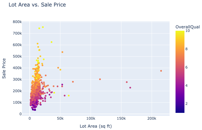
Example: Lot Area vs. Sale Price
# Create a scatter plot using Plotly
fig = px.scatter(df, x='LotArea', y='SalePrice', color='OverallQual',
                 title='Lot Area vs. Sale Price',
                 labels={'LotArea': 'Lot Area (sq ft)', 'SalePrice': 'Sale Price'},
                 hover_data=['YearBuilt'])
The interactive scatter plot created with Plotly allows us to explore the relationship between lot area and sale price dynamically. By coloring the points based on overall quality, we can see that larger lot areas and higher quality ratings generally correspond to higher sale prices.
4. Correlation Heatmap
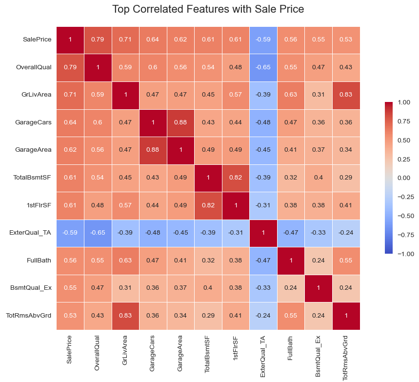
A correlation heatmap is a powerful tool for visualizing the relationships between multiple numerical variables in a dataset.
For the House Prices dataset, this visualization can provide crucial insights into which features are most strongly related to the sale price and to each other.
When dealing with a large number of features, the heatmap can become overwhelming.
To make it more interpretable, you can focus on a subset of features that are most relevant to the target variable SalePrice.
Step 1: Select Relevant Features
Identify the top features that have the highest correlation with SalePrice.
Step 2: Create a correlation matrix with the top features
Step 3: Create and Save the Heatmap
Generate the heatmap with the selected features.
# Compute the correlation matrix
corr_matrix = df.corr()
# Select the top features that correlate with 'SalePrice'
top_corr_features = corr_matrix['SalePrice'].abs().sort_values(ascending=False).head(11).index
print("Top correlated features with SalePrice:\n", top_corr_features)
# Create a new correlation matrix with the top features
top_corr_matrix = df[top_corr_features].corr()
# Create the heatmap
plt.figure(figsize=(11, 8))
sns.heatmap(top_corr_matrix, annot=True, cmap='coolwarm', vmin=-1, vmax=1, cbar=True, square=True,
            linewidths=0.5, cbar_kws={"shrink": .5})
plt.title('Top Correlated Features with Sale Price', fontsize=16, pad=20)
plt.tight_layout()
Interpretation of the Heatmap
The heatmap displays the correlation coefficients between the top 10 features most correlated with “SalePrice”.
Top Correlated Features with SalePrice:
- OverallQual: The quality of the material and finish of the house has the highest positive correlation with
SalePrice. This indicates that better quality houses tend to sell for higher prices. - GrLivArea: Above ground living area is also highly positively correlated with SalePrice. Larger living areas contribute to higher house prices.
- GarageCars: The number of cars that fit in the garage has a strong positive correlation with SalePrice. More garage space is associated with higher house prices.
- GarageArea: Similar to
GarageCars, the area of the garage is positively correlated with SalePrice. - TotalBsmtSF: Total square feet of the basement area shows a positive correlation with SalePrice. Larger basements generally lead to higher prices.
- 1stFlrSF: First floor square feet is positively correlated with SalePrice.
- ExterQual_TA: The quality of the material on the exterior of the house is Average/Typical. It is negatively correlated with SalePrice.
- FullBath: The number of full bathrooms above grade is positively correlated with SalePrice.
- BsmtQual_Ex: This feature means the height of the basement is 100+ inches (Excellent). It is positively correlated with SalePrice.
- TotRmsAbvGrd: Total rooms above grade (excluding bathrooms) have a positive correlation with SalePrice (around 0.53).
Conclusion
Data visualization is a powerful tool for uncovering hidden patterns and insights in our data. By using libraries like Matplotlib, Seaborn, and Plotly, we can create a variety of visualizations that help us understand the underlying structure of our dataset.
These insights are crucial for building accurate predictive models and making informed decisions.
You can find the complete code for this visualization process in my GitHub repository.
Next Steps
In the next section, we will dive deeper into feature engineering to prepare our dataset for advanced regression techniques. Stay tuned!
